Freelance Copywriter Websites: (10 Key Elements)
Every freelance copywriter should have a website. Your social media is not enough. (Don’t argue. You need your own web real estate.)
Here are the key elements that belong on a freelance copywriter’s website.
These examples are from freelance copywriter André Spiteri, who recently launched a new website.
10 Essentials for a Freelance Copywriter Website
André nailed all the key elements for a freelance copywriter’s site. Here they are:
A clear statement of the copywriter’s niche
Professional portrait(s) and layout
Benefits of working with the copywriter
Testimonials from clients within the niche
Awards and client logos
Portfolio of samples from across the niche
An “About” page outlining relevant background
Services and indication of fees
An explanation of how to best work together
Calls to action to contact the copywriter
Make Your Writing Niche Big, Bold, Up Front
This is No Time to Be Subtle
Look at the top of André Spiteri’s home page. Can you guess the niche?
“Expert fintech copywriter” lets you know what to expect. Oh, hello Google!
He follows up with one sentence that gives you the specifics. He has fun with the descriptions. It’s wallet-opening web copy, authoritative blog posts, and objection-busting marketing literature.
(I was hoping for a hyphenated two-word adjective in front of blog posts.)
Think about that copy for a minute. Confident, human, a bit cheeky, in-your-face. He’s bold enough to tell you he’s an expert.
What’s the subliminal message in André’s copy?
“I know what I’m doing, I’m a professional, I’m not cheap.”
He says this more directly later, but the messages are already there behind the words.
A High-Paying Niche for a Freelance Copywriter
Just a note on the niche that André has chosen. Fintech is pure money. It’s an industry that works on innovation, leverage, and percentages.
Every advance made by a fintech company can mean millions of dollars, pounds, or euros.
They have marketing budgets and know the value of convincing messages. In other words, an excellent choice for a high-paying niche. I wrote about choosing a high-paying niche here.
More thoughts on finding the best clients for freelancers here.
Invest in Professional Portrait(s) and Site Layout
Look at André’s portrait. It’s well-composed and beautifully lit. It communicates personality.
It also works with the overall layout and colour. The green (colour of money?) pops. It’s bright, enthusiastic, and different from the blue you see everywhere.
Notice the type layout. The copy looks good. Sections are the same length where they should be. It’s what I call “writ to fit”.
I’ll bet André spent a lot of time editing this copy.
Everything on this site is under control—the photography, typography, colour, and the few graphics on the pages.
It looks professional and confident. Isn’t that what you want in an expert fintech copywriter?
Communicate the Benefits of Working with You
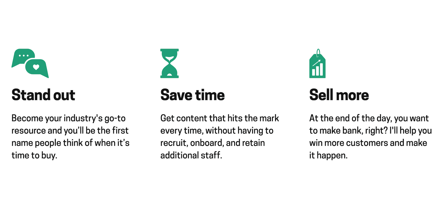
Still on the home page, André gives you the benefits of working with him. He tells the story with three two-word headlines, followed by tightly written copy.
Read the words slowly. This is a copywriter at work. The type is written for the design. Compelling, consistent.
See what he’s done here. Active verbs, all about client benefits. Tight, punchy, no blah, blah, blah…
He even gets in a competitive jab against bringing on a full-time writer. Just hire me, I’ll help you win.
This copy didn’t happen in the first draft.
Testimonials with Bold Headlines (Portraits Too!)
Just one of three client testimonials on the home page. More on other pages too.
Read the testimonials. They’re love letters, all of them.
“The best copywriter I ever worked with”
“An utterly exceptional fintech writer”
“André makes my life easier”
(Can I get you a glass of wine with that?)
What are the lessons here? First, get the testimonials. Then put them on the home page. Make them sing. Keep them short.
And for the chef’s kiss, add photos of the clients. Makes them so much more human and believable.
I’m guessing that André worked with the clients to massage this copy, editing to suit the layout.
In the past, I’ve written the testimonials myself and had the client approve them. It saved time, and I got what I wanted.
Awards and Client Logos
André calls the awards Seals of Approval. And below that, there’s a selection of logos of clients he’s worked with.
An excellent presentation, but I was expecting them to be clickable to show more information. A minor quibble.
The point is, both awards and client logos bolster your expertise. Use them if you have them.
If you’re starting, you may not have any awards yet. That’s fine. As soon as you get some, add them.
Portfolio of Samples from Across the Niche
How do copywriters show samples of their work? André created three categories and included samples for each.
A section of the portfolio featuring blog post thumbnails. They’re clickable to show more of the copywriter’s copy.
That’s a good indication of the types of writing he’s done, and more precisely, what he’s written. The trick is to get the screen captures as soon as they go live. Things change, often not for the better.
There are six in each category, for a total of 18. That’s more than enough.
From his samples, you can see that besides the fintech work, he has written for other types of clients. It takes a bit away from the fintech focus, but shows different sides of his expertise. It didn’t bother me. There’s plenty of fintech here.
A Smart “About” Page
One section of the About page. Here he tells you a bit more about how he works.
Read André’s “About” page. The copy is a delight. Why hire him? He’ll tell you. How does he work? He’ll tell you with a link to his process. There’s more proof of his work, too.
Also, more testimonials, again with blazing headlines and compelling copy.
He wraps it up with some personal history topped by a laughing portrait. (He was a lawyer! Didn’t like law, but loved writing. Gave it up to become a copywriter.) What’s not to like?
Copywriter’s Services and Indication of Fees
This is an excellent introduction to his services. The headline, “Let’s tell the world how brilliant you are” sets the tone. Then he tells you what he does and what he charges at a minimum.
There is so much to learn in this little section. Take time to study it.
Stop to analyze this for a minute. There are prices here. Note how they’re stated: “from £”. They’re not quotes, they’re the least he charges for each service.
What’s implied here? “Your job will likely be more, but certainly not less.”
Usually, I don’t like prices on copywriters’ websites. But this is a perfect way to do it. Kudos!
It discourages price shoppers and bargain hunters. It shows the league André plays in. And it’s not just him saying it—go back and read the testimonials from happy clients.
Again, look at the design. Two-word heads, carefully-pruned, consistent copy, tight little icons. Do you think André is organized and has control over his work? It sure looks that way.
How Do You Work with This Copywriter?
Still on the Services page, André tells you what he expects from clients. He takes control.
This is his proven process that leads to success. It starts with a proper brief, not just word salad shouted over the phone. And there’s more… wireframes, testimonials, buyer personas, etc.
This is Phase 1 of the Process
There are three phases in all. This is no-bullshit, serious work. “You do your part, I’ll do mine.”
What’s unspoken here? It doesn’t sound like André responds to crazy “I need it tomorrow morning” deadlines. First, you get me all this stuff, then I do the work.
Tip for copywriters: copy, adapt, and use some version of this page on your site. It shows expertise, confidence, and sorts out prospects before you start.
Also note, more testimonials. Can you have too many? André doesn’t think so.
Call to Action on Every Page
All pages end with a Brief Me button that links to the Contact page. But look at the delightful bit of copy before each button. André doesn’t miss an opportunity to make a connection.
Your new customers are out there, waiting... Let’s bring them in. Brief Me
My fingers are hovering over the keyboard, ready to go Could I be working on your copy next? Brief Me
Let’s get cracking Need help turning ideas into wallet-opening copy that brings customers to your door? Brief Me
Like what you see? I knew you had great taste. We should work together. Brief Me
Lesson here: have a short bit of human copy with a button on every page.
Never miss a chance to move to the next phase. Brief me.
Summary of Essentials for a Freelance Copywriter Website
Make your niche upfront and obvious
Invest in professional headshots
State the benefits of working with you
Get lots of client testimonials
Feature awards and client logos
Make a portfolio using screenshots of samples
Create an “About” page with relevant background
Include a breakdown of services with an indication of fees
Guide prospects on how to best work together
Finish with calls to action on every key page
See André’s site here at Maverick Words.
New Book For Freelancers
I’ve just published How to Become a Successful Creative Freelancer. It’s the essential business guide for freelance writers, designers, developers, filmmakers, and photographers.
Whether you’re just starting as a freelancer or have years of experience, you’ll learn a lot from this book.
It’s broken down into easy-to-understand chapters with strategies and tips you can use today. Not just “what to do”, but also “how to do it”.
It’s available now in Kindle ebook and paperback on Amazon.
Want to Grow An Agency? The Agency Book is For You
If you’re looking for tips on how to build and grow your agency, you’ll want to read How to Start a Successful Creative Agency.
Available at Amazon (Paper & Kindle), Kobo (ebook), Apple Books (ebook), and Gumroad (PDF).
The book is packed with useful information to help creatives start and grow their business.
Practical Value from Real Experience
“Loved this book. As a copywriter and content writer, I look for books that can help me strengthen my skills. Many books have too much fluff and I easily forget what they teach me. Not this one.
Andy provided great value. This book is built on his real experience as a two-time agency owner and he offers advice for professionals from every level and age group. Great read!”
Verified Purchase, Amazon.com, 5-Star review
Want a free taste first?
Sure! Sign up below to get a free PDF of Chapter 14 of the Agency book, Working With Clients.
This chapter covers essential areas such as Clients vs. Projects, Corporate Clients vs. Small Business Clients, How to Create an Opportunity Document, Benefits of Finding a Niche… and much more.
Questions? On Twitter, I’m @StroteBook. D.M.s are always open. Ask away.


